"Sub88:Understair" by David Vineïs

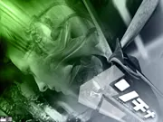
Is it fine art or a backdrop for advertising? Perhaps it would be best presented without the white letter-like boxed imagery and wording on the right. I do like the play of light and the use of grays with a strong complimentary neon green. These elements along with an artful overall composition make it notable.
Ahead of the Wave
The contemporary art collector has yet to fully recognize the value of digital fine arts. In part it is a lack of understanding for which we are all tasked to address. We might start with better understanding why collectors buy what they buy. It is most certainly insight worthy of consideration and investigation.
:::Recommended Reading:::
Books to encourage a better understanding of the art market from a collectors perspective:
In English:
Owning Art, The Contemporary Art Collector's Handbook;Editions of "Triumph of painting of the Saatchi gallery,(three volumes) + Abstract America, Germania and USA Today; “Seven Days in the Art World” by Sarah Thornton; "Women Gallerists"(ISBN is 978-3-7757-1975-9).
In German:
“Artinvestor Handbuch” edited by Edgar Quadt; “Frauen, die handeln. Galeristinnen in 20. und 21. Jahrhundert”,by Claudia Herstatt
In Italian:
“Economia delle Arti” by Candela and Scorcu;Angela Vettese's "Capire l’arte contemporanea" and "Ma questo è un quadro?"; "Come comprare l’arte contemporanea" by L. Buck and J. Greer.
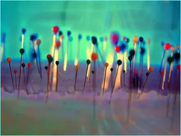
Matchsticks….pins…? Okay it is what it is and I like it! Visually stimulating, I can easily see this artwork printed in a large scale format hanging on my living room wall. Nicely executed the imagery keeps your eyes moving resting only momentarily on varying depths of detail. Emotion runs deep within the work's simplicity. I am particularly drawn to the right side of the image where background, mid-ground and foreground blend into a light-headed frenzy. Frankly, it’s just cool.
________________________________
Comment Here...
Your name
Your email (not revealed)
Comments
This page once had an online form that ran on the old server. Please email [email protected] instead.
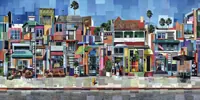
Ah, what great patience and perseverance the artist Hammond has. This patchwork photo-based composition is playful and unassuming. There’s not a lot of hidden meaning here. Laid out for the viewer in a grid of squares and rectangles texture abounds. The piece is both lively and whimsical.
This page is for you!
Over the past two weeks “Mary’s Page” has been viewed by many visitors from countries all around the world: Chile, Japan, Germany, Brazil, Spain, Greece, India and the US. It is off to a great start but I'd like to hear more from you! Your input is vital to keeping the page relevant and fresh. The intent of the commentary is to offer reflection, foster motivation and encourage art discussion. If you would like to see additional content and/or if you wish to contribute please send me a note. All input is welcome.
(See comment form.)
Quote:
“If your life is free of failures, you're not taking enough risks." ::: Anonymous :::
This page posted 15 June 2009
CURRENT PAGE